This post came from a design review I did with a friend on their app. It's less a blog post and more of a specific critique for someone else's project (used with permission though). It should be taken with a huge grain of salt; I'm no designer.
The reason your design feels unpolished is because it's doing too much.
Avoid doing too many things at once
Think of every font family, font color, spacing number, alignment, button width, background color, or any other design element as a "design unit". Your job is to accomplish as much functionality as you can with as few as possible unique design units.
For example, let's count how many unique design units used on an extremely basic screen.
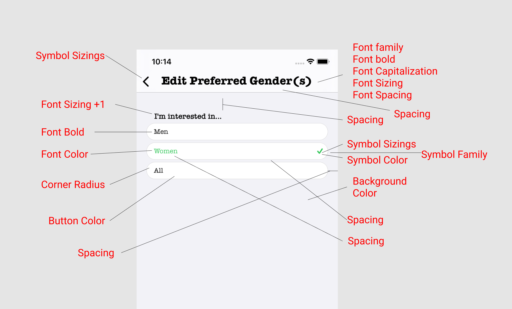
Behold! You have nearly 20 unique design units on a page (not including Apple's own units) that's entire job is to have someone decide between three buttons.
Only use new design units when you need contrast to explain functionality.
For example, setting the color of the selected "Women" button is a good choice because without it you wouldn't be able to tell that something is selected! In other words, the "design unit" of font color is different (contrasting) with the items around it, which is how you've signaled to the user that this is a bit of functionality.
But you could just have easily used any other design unit to make the button "selected". For example, you could have made the font bold, or made the button bigger, or given spacing around the button, or flipped the button upside down, or changed the font, or all sorts of things. Not all of these are good ideas, but it's the reason professional designers use different fonts and colors and other stuff. It's not for flair, it has a purpose.
Rule: only add a new design element when you need it to explain functionality that you can't explain with your current design elements.
Keep a limited palette of design units.
You're probably familiar with a color palette. You should do the same with font families, font-boldings, corner radiuses, spacing, etc. If you use 16px of spacing in one place, use 16px of spacing everywhere else unless you absolutely need to use more or less to signify a group.
Take stock of your current design units and reduce the amount you're using. For example:
- Use the standard iOS font. Your extra font is eating into your design unit budget.
- Set a "small", "medium", and "large" spacing. For example: 4px, 16px, 32px.
This will look boring at first. You will make these changes, and you'll look at your app and think "this looks boring!" You'll look at other apps and say "see they have TONS of different design units and they look great! Why have you lied to me Evan?"
This is entirely normal for new products. The difference is that apps you're used to using have wildly more functionality then yours does. Take github for example:
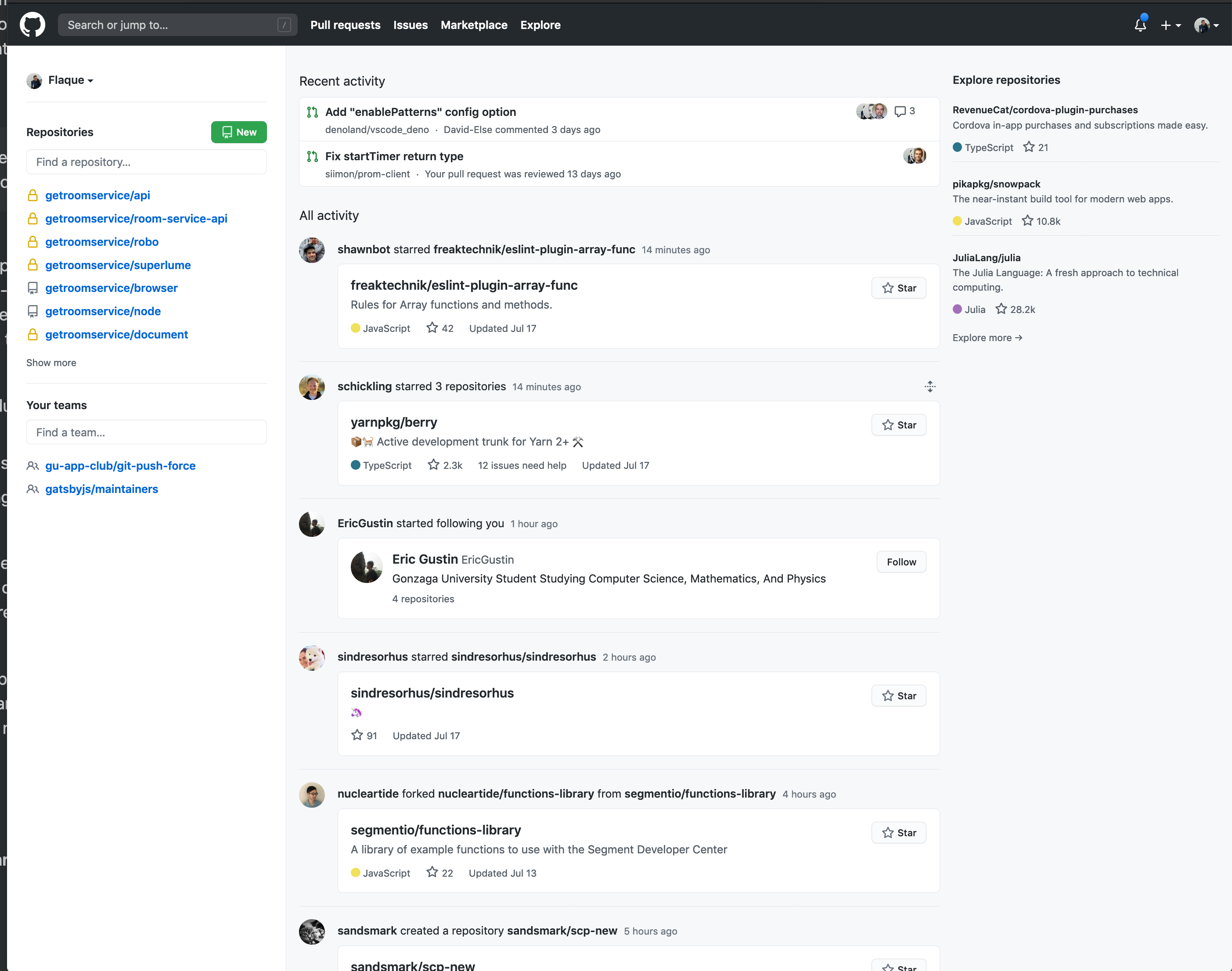
Github looks pretty good and yet it has LOTS of different design elements! But it also has just tons of packed in functionality. There's so much you can do from this one page (that's not necessarily a good thing). But notice that it's typically only adding new elements when it absolutely needs to.
And because of that, it's got a really high ratio of functionality to design elements, which is what you're shooting for. If your app feels spartan, just give it some time. Build out more of the cool features you want to add and it'll start to feel better.
There are different "levels" of contrast.
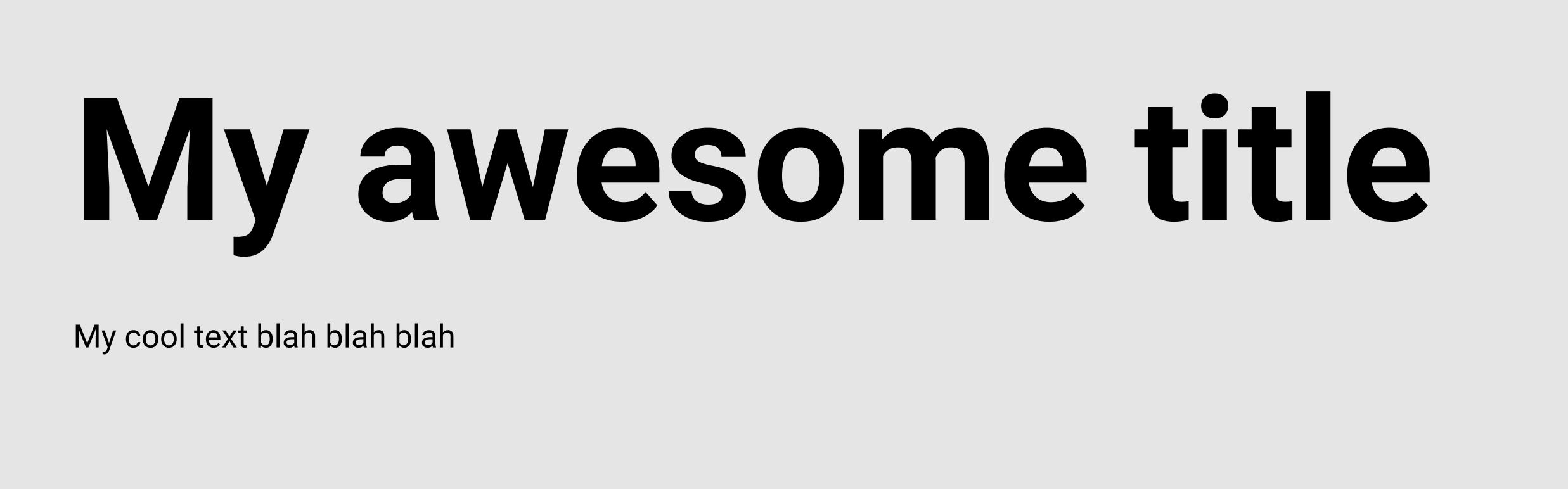
Design units are not all equal. Individual units can provide more or less contrast. For example, this provides a LOT of contrast:
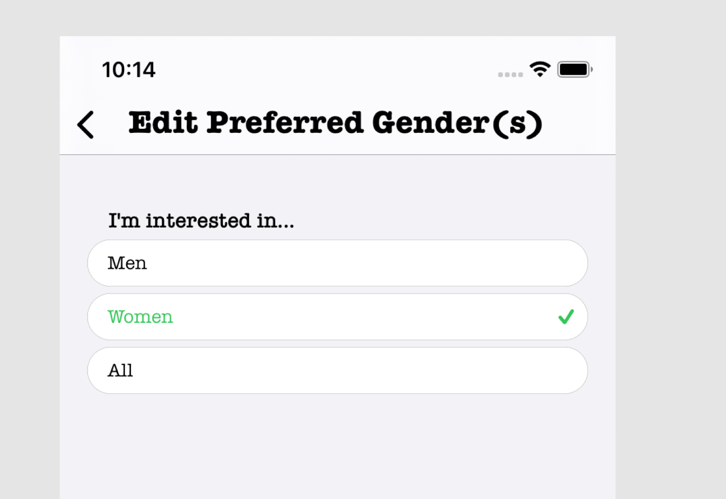
And this provides just a little contrast:

But both use the sname number of design units. Use this to your advantage. Contrast is how you get a user to notice your functionality, and so if you put contrast in the wrong places, it will draw the attention to unimportant stuff and your design will feel "wrong" somehow.
For example, let's take your screen from above:
The most important part of this screen is the buttons. But where's the contrast drawing you to? THE GIANT HEADER.
It's so big and bold and black that it overshadows the content. In text, (like this article...), you want titles to be big and bold and black because they're the hook. The contrast draws the user to the particular section and so needs to be really eye catching. In apps though, you don't need this, which is why many apps get rid of the title all together.